A Case Study on Social Media Logo Evolution
Social media sites have some of the best logos around as they have evolved through their growth and success. We can recognize them immediately even if they take any shape at any point in time.
The minds behind these social media logos have done their job so well that these logos can serve as case studies of how organizations should create their brand with logo design.
Check out the infographic to know about the social media logo evolution of some of the popular brands including the hot one – Facebook logo evolution.

Share this Image On Your Site
Note: Feel free to share the Infographic that started with Facebook logo evolution or add it to your own website by keeping a backlink to this page.
Let us start with the Facebook logo design, as the first example of the Social Media Logo evolution over the course of time.
1. The Facebook Logo Evolution
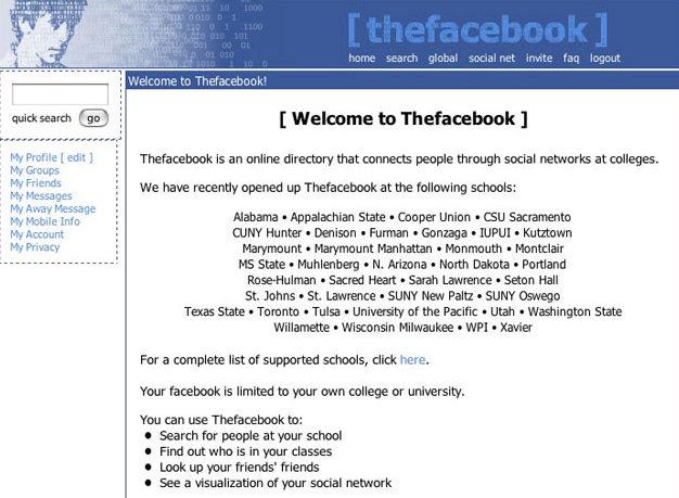
Originally called ‘Facemash’, Facebook was started as a Harvard University networking site by the founder Mark Zuckerberg and then later renamed ‘Thefacebook’. Once the name again changed to ‘Facebook’, he hired Mike of the Cuban Council to design the brand identity of the network site.

The first form was a modified version of the typeface Klavika designed by Eric Olson. Its final appearance was finished by the graphic designer Joe Kral, with the project overlooked by Buzzard.
The interesting part of Facebook logo evolution is the story behind the color of the icon. It was said that the distinctive hue was selected for the brand identity as Zuckerberg could clearly distinguish only this color because of ‘deuteranopia’.
The design retained its brand identity for the next decade keeping exponential growth of the brand across the world and only some minor modifications were made to the logo in the year 2015 resulting in the changes to a single-deck ‘a’ and a stem on the letter ‘b’.
Since more and more users were moving on to Apps, it was important for them to get another update in 2019, with a new circular icon replacing the dark blue block of old.
In general, as far as the Facebook logo evolution is concerned, the group has made important tweaks as the situation demanded and it proved that Facebook has done everything right at the right time.
2. The Evolution of Instagram’s Logo
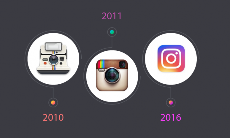
Instagram’s CEO, Kevin Systrom designed in 2010 the original image that looks like an old-style Polaroid camera. The next logo made in the year 2011 was a simpler camera icon but still skeuomorphic with the help of Cole Rise, a professional designer, and photographer. The Instagram logo evolution was on till 2016 when Instagram released a new, dramatically minimalist design that had been created in-house over a nine-month period bringing forth what we have now.
3. The Evolution of Pinterest’s Logo
If we look at the social media logo evolution of Pinterest, its logo initiated in 2010, and the brand is the largest source of ideas helping people discover many kinds of image manipulations. In 2017, Pinterest released the new logo which is much bolder than ever now. As a brand identity, they keep the pin ‘P’ with the new logo, and it continues.
4. Medium in Social Media Logo Evolution
The medium was launched in 2012 by Evan Williams, the co-founder of Blogger and Twitter as another platform for people to publish writings longer than Twitter’s 140-character (now 280-character) maximum. Its initial logo was based around a monochrome, slab-serif M, using the Stag typeface. Medium worked with type designer Rod Cavazos, brought out a new logo in 2015 that beautifully picks up on the angles and spirit of the first logo. In 2017, Medium took a sharp U-turn and released another new logo which looked almost the same as the first logo
5. YouTube Logo Evolution
Former PayPal employees-Chad Hurley, Steve Chen, and Jawed Karimon, launched YouTube on Valentine’s Day 2005 with a logo that consists of the word ‘Tube’ inside a red rounded rectangle like a television. In 2011, a new YouTube logo design was released with a flatter rectangle in a darker shade of red. In the yar 2017, YouTube dropped the TV shape surrounding ‘Tube’ and pushing it to another side making it like a play button.
6. The evolution of Twitter’s logo
In 2006, Twitter’s original logo was created by Swedish graphic designer Linda Gavin, who was given just one day to make the design. The logo represented the name of the company in a fun way with child-like letters. The evolution of the twitter logo undergone further variations in the years 2007 and 2009. Twitter’s third logo redesign, ‘Twitter Bird’ icon was released on June 5, 2012. Twitter Bird design is based on a mountain bluebird with its wings that are made up of three overlapping circles.
7. The Social Media Logo Evolution – Snapchat
The Snapchat logo, launched in 2011, was drawn by company founder Evan Spiegel on his computer in his dorm bedroom before the company even had a name. The logo evolution went on till 2019, Snapchat released its ghost icon, outlining it more than previously with a thicker black line.
8. The Evolution of LinkedIn Logo
LinkedIn started its service in the spring of 2003. The LinkedIn logo evolution went on with slight changes to its design in the year 2011 and it came up with the current look in 2019.
Starting from the Facebook logo evolution with its iconic blue logo of the 2000s, the above stated 7 businesses passed through the most drastic logo changes in branding history.


1 Comment